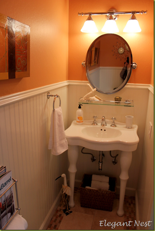
I first shared pictures of my downstairs powder room in this post, here is another shot of this little 1/2 bath…
I mentioned in that post that I was considering a bold wallpaper for this space. Then, the other day as I was reading some favorite blogs and came across this photo…
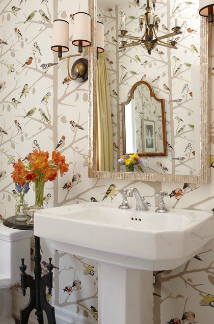
Sara Richardson via HGTV
And it got me thinking about wallpaper all over again! I love the bird and tree motif in this wallpaper, and think it would be a fun addition to my powder room. Not that I need to add another project to my current “to do” list, but I am definitely going to move this idea up a few notches!
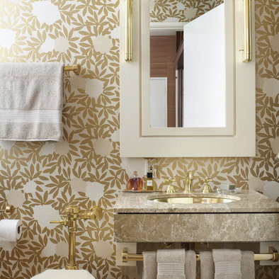
Here are some other amazing bathrooms featuring bold and beautiful wallpaper…




After doing a little online research, I found the source for the bird wallpaper…


It is from Schumacher and the pattern name is A-Twitter…cute! Using wallpaper in a small space like a powder bath is the perfect place to go big and bold. This paper would bring life to the space without weighing it down too much. I think it would look great paired with the white wainscot and trim.





Absolutely!! Do it!
ReplyDeleteAgreed. It will be a little jewel! :)
ReplyDeleteLove the bird wallpaper.
-Revi
I love the bird wallpaper! It's so cute! I wish I was brave enough to make that kind of statement, but if you're going to do it...the powder room is definitely the place. I can't wait to see how it turns out.
ReplyDeleteI went big and bold with the wallpaper in my powder room and I'm so glad I did! It gave our little room so much personality! Love the bird wallpaper...sophisticated yet whimsical. Do it, you won't regret it!
ReplyDeleteI'm not a wallpaper fan, but I love this bird wallpaper! I think a small room is great for going bold.
ReplyDeleteI'd do it! The print is really nice and I agree that it'll look great with all the white that's already in there!
ReplyDelete